Continuing the recent line of posts about SF residential development, I’ve finally decided to aggregate residential completions over the past 3 1/2 years rather than look at present development. While not surprising, the results are stark: SF housing additions are extremely concentrated in a handful of areas, particularly the South of Market area.
I have also used this post to experiment with the geopandas package in python. I am a complete novice and ran out of patience for some of the legends for these graphs, so apologies for their quirks. Hoping to update this post when I’m more experienced!
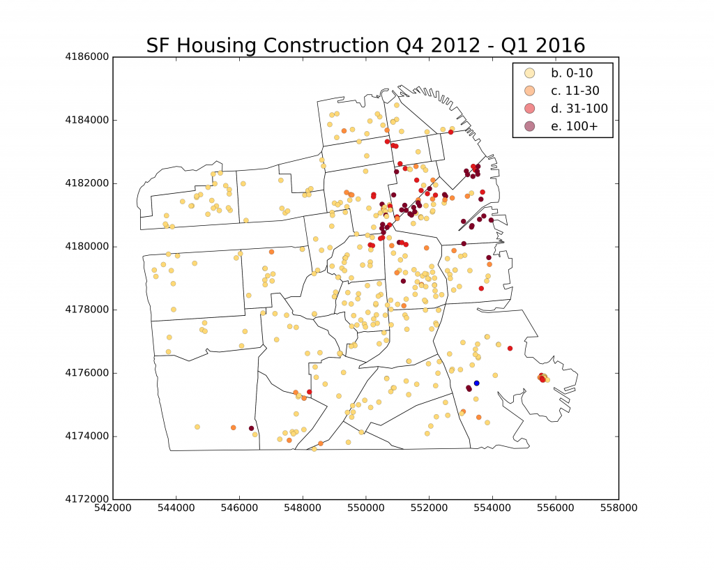
Onto the data…first, let’s plot dots of completed construction projects in the past 3 1/2 years. In particular, these are residential completions in the SF development pipeline from Q4 2012 – Q1 2016 because this is the only period for which there is consecutive data. The graph shows what we’ve seen in my previous posts of recent development: spread out, but with much larger developments on the eastern side of the city and, in particular, along the Market Street corridor. In anticipation for my next two maps, I overlay this data with neighborhood boundaries for San Francisco from Zillow. That one blue dot in Bayview has negative 1 units added. I sadly have not yet found a good way to integrate it into the legend.
Next, the moment we’ve (read: I’ve) been waiting for… let’s aggregate by neighborhood! For those interested, I do this by performing a spatial join in geopandas between the two layers (both projected into UTM zone 10).
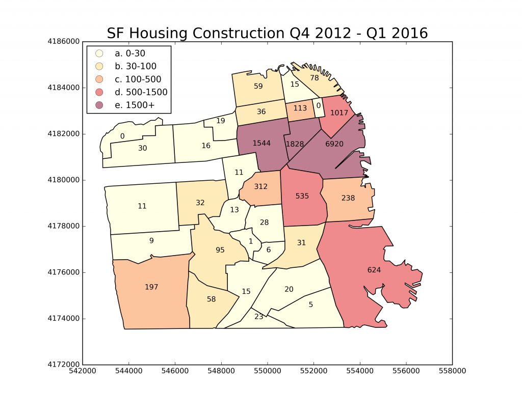
While not totally unexpected, the map is startling. Pretty much all of the residential additions in the past 3 1/2 years are on the eastern half of the city, and SoMa has added more than 3 times the amount of units as the nearest area. Moreover, areas like Richmond and the Sunset District have added less than 50 units each! Although the housing supply is growing with demand, not every area of the city is sharing this burden. It’s important to point out that this is due to deliberate zoning decisions made by the planning department in the past 10 years. However, behind every planning decision is tremendous political pressure from neighborhood associations and the like. This development pattern can ultimately be traced back to NIMBYs.
Finally, let’s look at affordable units by neighborhood.
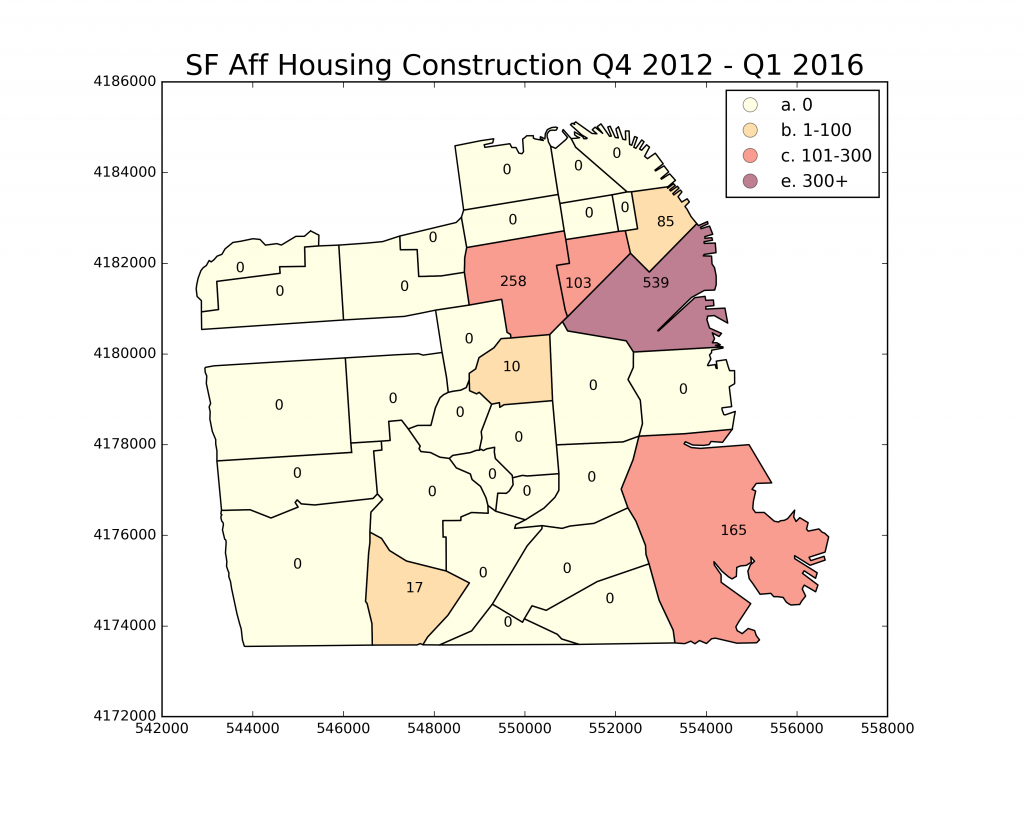
In general, the same areas building any units are the same ones building affordable units. But look at all the zeros! Clearly affordable housing is not an enticing prospect for most of the city. SoMa, I declare you the winner.