San Francisco’s housing crisis is no secret. As perhaps the biggest city planning issue in the Bay Area, activists from all over the region—neighborhood organizations, planning professionals, NIMBYs, and YIMBYs—have fiercely debated and fought over new housing, development by development. Yet for all of the concerns and passion surrounding the issue, it is surprisingly difficult to find data on where, when, and by how much housing is being produced within the city.
In this long-form post, I try to bring this information to life from the data annals of the SF Planning Department. To preview what’s below, I explore patterns of housing production within San Francisco—where, and by how much has housing increased in the past few years? Next, I combine this data with neighborhood rent patterns from Zillow to explore how this production might relate to housing affordability.
Context
San Francisco has been producing tens of thousands of new jobs while typically only adding between two to four thousand new housing units each year (Moretti 2013). By the laws of supply and demand, this has naturally led to a shortage of affordable housing. This is not just a problem that affects the poor. Some economists have estimated that if metropolitan areas increased housing supply with outside worker demand, U.S. GDP could by as much as 9.7% (Chang-Tai and Moretti 2015).
Governments recognize that this is an issue. As part of the state-mandated Regional Housing Need Allocation (RHNA) process, the Association of Bay Area Governments (ABAG) has targeted San Francisco to provide 28,869 additional units of housing between 2014 and 2022 (ABAG 2014, p. 24). As we will see shortly with the maps of recent production in the past 3 ½ years, current production is roughly on track to achieve this goal. At the beginning of 2014, San Francisco had an estimated 379,597 units, so meeting the RHNA goals would represent about an 8% increase in housing (SFPD 2015, p. 5).
The Development Process
Note that the RHNA goals are not binding. Instead, this just means that San Francisco has to plan to accommodate this much housing by providing favorable zoning and funding to support these goals. Ultimately, meeting housing demand is up to the market. Although the development process is endlessly complex, I will spare my readers the gory details in exchange for some key points to understand the maps below.
There are two parallel permitting tracks: building permitting and planning permitting (entitlement). While the former ensures that a building meets building standards, the latter makes sure that it conforms to the land use zoning regulations. After construction, the Departments of Building Inspection looks over the development one more time and issues a Certificate of Final Completion, which is when I mark developments as completed in the maps below. With all this red tape, the median time from submission of first proposals to completion is typically 3 ½ years (“SFPD 2014, p. 15).
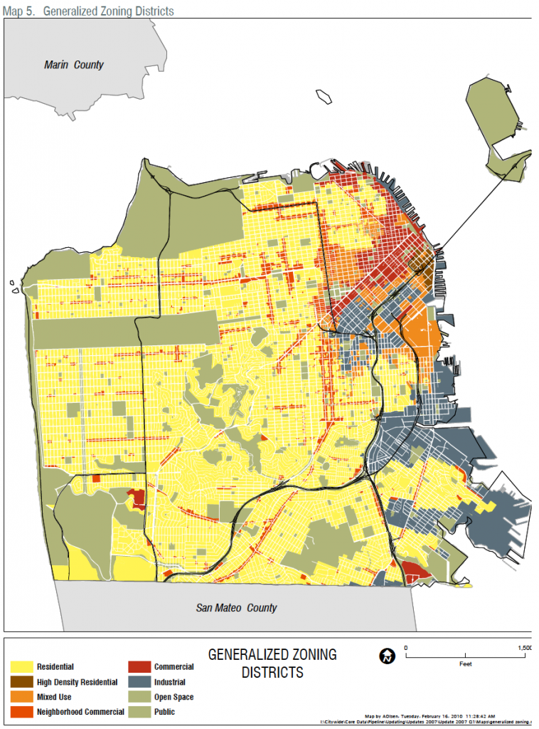
All this is to say that there is no getting around the zoning code. If there is any hope for a variance, developers usually need the support of the community, which typically decries any project out of scale with the ‘character’ of nearby development (Dineen 2016). These facts, combined with the map below of the zoning code, foreshadow a result that we can see in the interactive maps: highly concentrated development in the few places that it is allowed.
Figure 1. – SF Zoning Code 2014
Map of Residential Projects
The interactive map below allows users to click on the dots to see more details about each development. I have also linked the data with the Google Maps Javascript API for street view panoramas. Hopefully this can give users a sense of the neighborhood for each development. Furthermore, the map allows users to switch between recently completed projects and currently proposed projects. The map for recently completed projects shows residential completions in San Francisco from the SF Planning Department’s Development Pipeline Data. This data tracks residential completions between Q4 2012 – Q1 2016 (the only period for which there is consecutive data). The first thing that stands out to me is that the total number of projects seem fairly spread out. Despite this, it is clear that large recent developments have been concentrated in certain areas. In particular, the Market Street Corridor, SoMa, and the Dogpatch appear to have particularly high levels of development.
As for currently proposed developments, these appear to be a bit more dispersed but with the same general trends. Note that there are more dots for the currently proposed data because this includes all projects currently in the development pipeline, no matter how long the time horizon. This data includes all projects that currently have applications on file with either the planning department or the Department of Building Inspection and so they span from planning permits that have just recently been filed to construction. Furthermore, this map assumes that all projects will be brought to completion, which overstates what will actually be built. However, this map is probably a realistic prediction of what future development will look like on average.
Map by Neighborhood
The dot maps suggest that large residential development are concentrated, but in order to get a better sense of this concentration, I have aggregated units built with a polygon map. Because I will shortly examine development’s impact on neighborhood affordability, I use neighborhood boundaries from Zillow for this aggregation.
While not totally unexpected, it is startling to see how concentrated development is. Out of the 13,950 net units added over this time period, about half of these come from one neighborhood: SoMa. Furthermore, the top five neighborhoods—SoMa, the Financial District, Downton, the Western Addition, and Bayview—comprise 11,933 net units, or 86% of that total. By contrast, large areas in the western part of the city, such as Richmond or the Sunset District, have added less than 50 units each.
Although the housing supply is growing with demand, not every area of the city is sharing this burden. It’s important to point out that this is due to deliberate zoning decisions made by the planning department in the past 10 years. However, behind every planning decision is tremendous political pressure from neighborhood associations and the like. We can probably trace this development back to NIMBYism.
Impacts on Neighborhood Affordability
As an example of a research question that can use this data, I have merged the map data with Zillow’s neighborhood-level median rent index.[1] Has increased housing supply helped stem rising rents in neighborhoods with a large amount of residential development? Or could it actually have led to increasing rents? Contrary to basic microeconomic theory, some claim that increased development at a local level can actually increase rents due to positive externalities from property value improvements.
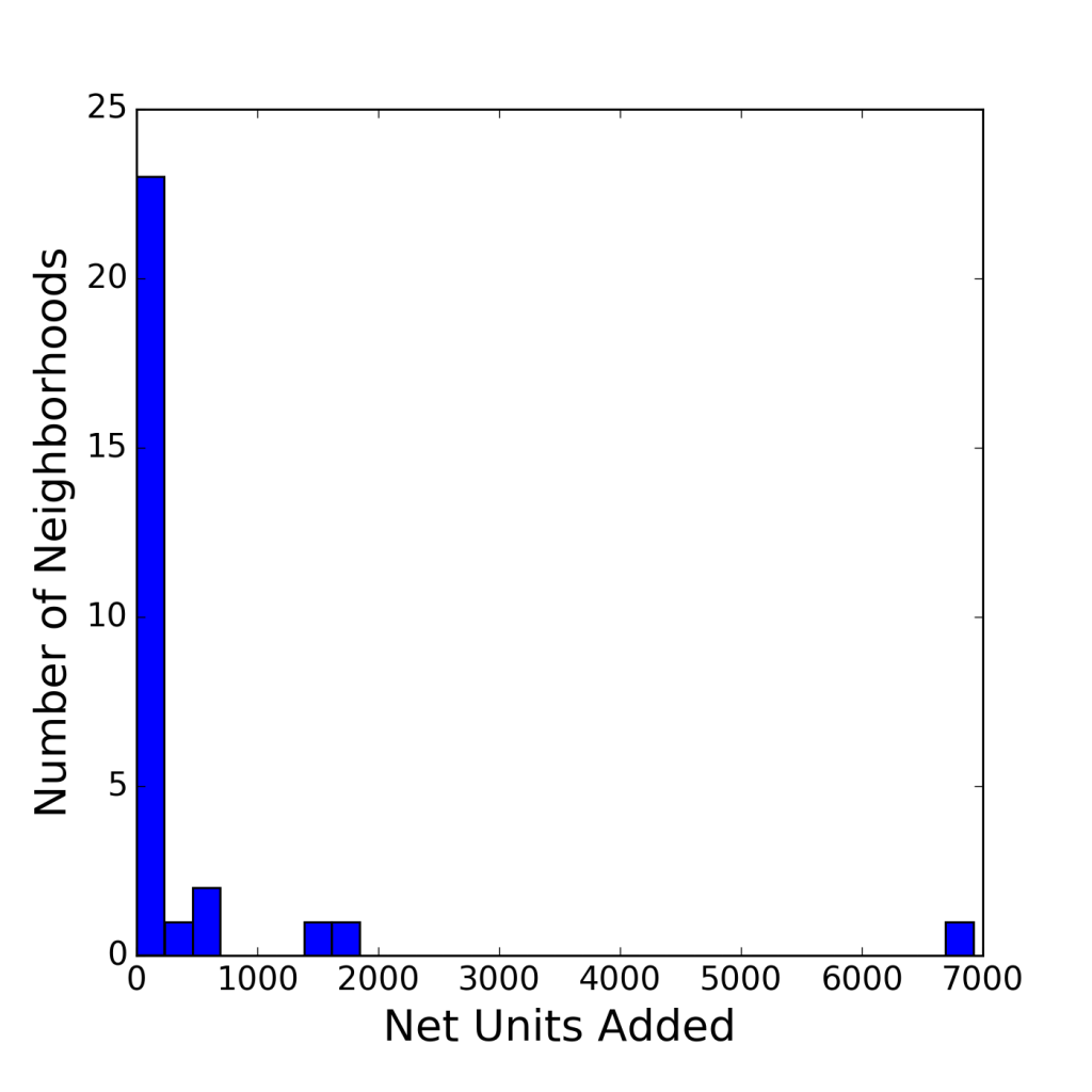
First, I examine data on recent units built between Q4 2012 and Q1 2016 and rent change over that same period in histograms. The first histogram reveals the truly extreme nature of the outliers. First, the figure shows that the overwhelming majority of neighborhoods added less than 200 or so units. Second, there is a small middle group that added between 500 and about 2000 units. Finally, there is SoMa in a class of its own.
Figure 2. – SF Units Added by Neighborhood
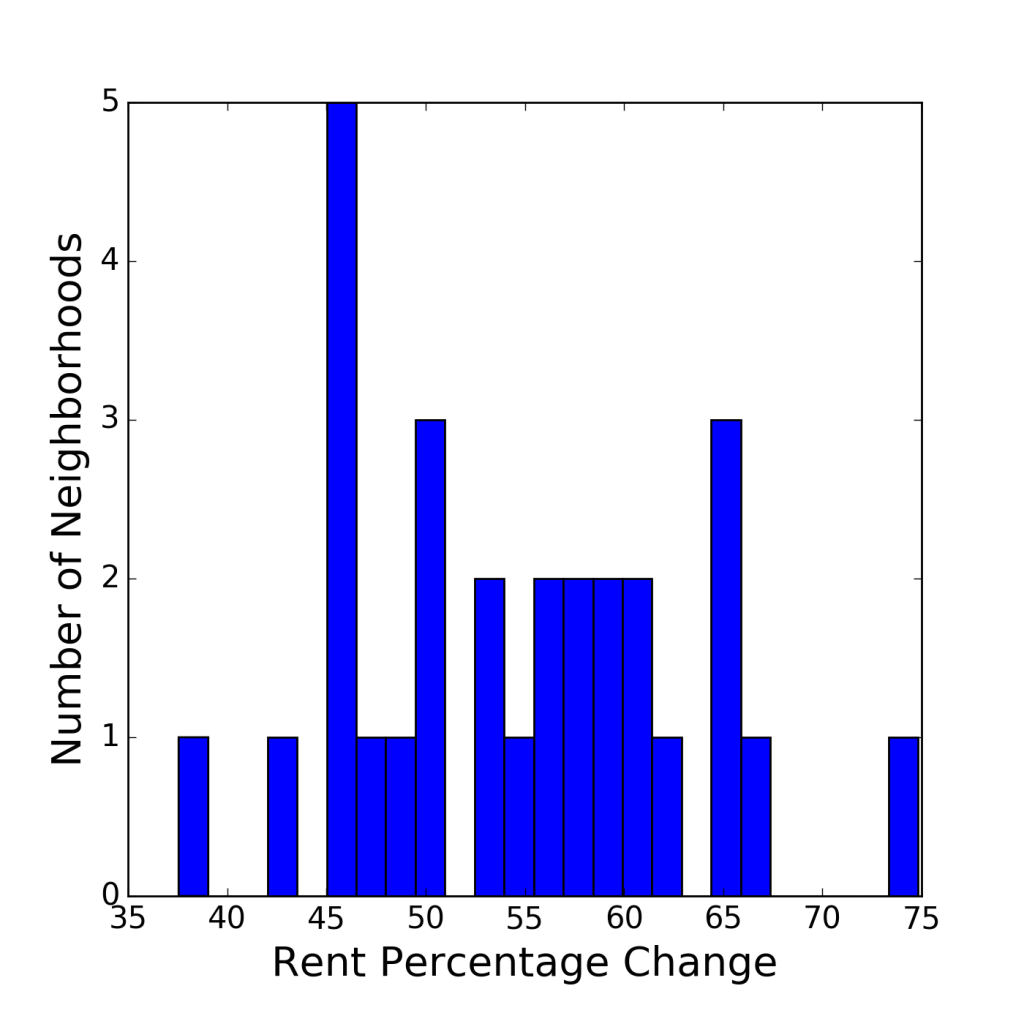
The second histogram shows that despite the high concentration of development, rent change is fairly evenly distributed across the neighborhoods. In good news for proponents of economic theory, two of the 5 neighborhoods with the lowest percentage increase in median rent—SoMA and the Western Addition—were also in the top 5 in units produced. However, the other 3—the Twin Peaks, North Beach, and Parkside—all added less than 100 units.
Figure 3. – SF Neighborhood Rent Change
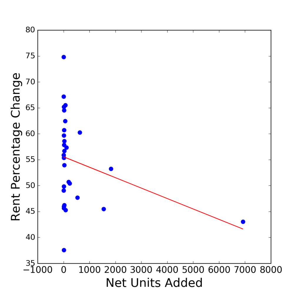
To get a more complete sense of how increasing units in the market impacted rent change, I estimate the correlation between net units built and percentage change in rent. In particular, I estimate a line of best fit between these two variables with the ordinary least squares method. The figure below shows this line. The line does have a negative slope, indicating that for every 1000 units produced prevents rent increasing by about 3-5 percentage points. However, it is difficult to trust the negative slope of the line. The result is heavily influenced by one outlier, SoMa, which can be seen in the lower right-hand corner of the plot. The r-squared of the estimate—or the measure of how much of the variance in rent change is explained by units built—is only -.06. This indicates that only approximately 6% of the change in rent can be explained by the amount of units produced. In sum, there does not appear to be any clear relationship between rent change and units produced.
Figure 4. – Rent Change Versus Units Added
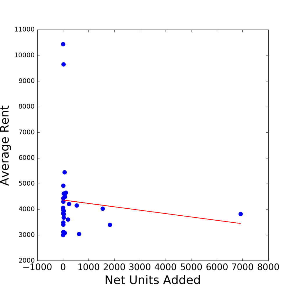
Lastly, I examine the relationship between average rent over the period Q4 2012 and Q1 2016 and net units produced. Perhaps wealthy neighborhoods with high property values restrict development through political influences on the zoning process and we can reveal this through correlations. In this case, the lint of best fit is also negatively sloped, indicating that a 1000 units increase in housing is associated with approximately 130 dollars less average rent. However, like the previous figure, it is difficult to give much weight to this result. The dots show that they are essentially uncorrelated with one another. In this instance the r squared is only -.026, indicating that about 3% of the variation in average rent can be explained by the amount of units built.
Figure 5. – Average Rent Versus Units Added
Yet, the fact that there is essentially no correlation in these two graphs is a result in itself. Although housing production has a clear impact on regional housing prices, the local impacts of increased supply are less clear. Getting to the bottom of this question requires data for a longer period, a more fine-grained geographic unit, and a complicated econometric model. There is no clear narrative one way or another, and that’s part of the reason that housing debates are so contentious.
Why Should Planners Care?
America’s cities are, for the most part, rapidly growing. In particularly high-demand areas like the Bay Area, this rapid growth is leading to rapid growing pains. With this development comes the need to build, but local zoning laws often confine the areas where that growth can happen. In fact, as we have seen above, the vast majority of growth can be concentrated in a very small portion of the city. This places a disproportionate share of the burdens of growth—crowded new developments, increased traffic, and tall new buildings—in certain neighborhoods.
It is no accident that neighborhoods like the Mission have been the poster child for gentrification in San Francisco. Yes, young professionals are attracted to the neighborhood because of its attractions, but the Mission is also one of the only places where new development is allowed. It’s time to shift some of the blame from gentrifying millennials to local planning decisions.
Furthermore, rapidly growing neighborhoods may not receive the benefits of increased housing supply with rent decreases. Although regions are clearly better of with increased housing supply on the whole, this makes little difference if the local benefits of development are ambiguous. Control over land use is local, and if cities don’t feel the benefits on the neighborhood-level, then urban areas will have a difficult time accommodating population growth with increased housing. Of course, we’ve already seen this with NIMBYs all across the U.S.
Moving Forward
I’m a firm believer that the first step in solving any issue is information gathering and sharing. That’s what I intend to do with this project and this blog moving forward. For tracking San Francisco development, I have set up a list of issues and future goals on the project’s github repository here. Items on the agenda include increasing user interactivity, increasing the time frame, exploring how current development relates to the existing housing stock, and, ultimately, gathering this data for other cities.
The housing debate starts with an honest, open dialogue and such a dialogue necessitates comprehensive and easy-to-access information. I hope that this project is a first step toward achieving that goal. Interactive maps of housing production might be useful not just for planners and developers, but also for neighborhood associations or residents interested in the broader context of regional housing development.
References
“2014 San Francsico Housing Inventory.” 2015. San Francisco Planning Department. http://www.sf-planning.org/ftp/files/publications_reports/2014_Housing_Inventory.pdf.
Chang-Tai, Hsieh, and Enrico Moretti. 2015. “Why Do Cities Matter? Local Growth and Aggregate Growth.” NBER Working Paper, no. No. 21154 (May). http://www.nber.org/papers/w21154.
Dineen, J. K. 2016. “In a Wealthy SF Neighborhood, Residents Fight Low-Income Housing.” San Francisco Chronicle. November 16. http://www.sfchronicle.com/bayarea/article/In-a-wealthy-SF-neighborhood-residents-fight-10617213.php.
Moretti, Enrico. 2013. “How to Make SF Housing More Affordable.” SFGate. http://www.sfgate.com/opinion/openforum/article/How-to-make-SF-housing-more-affordable-4590271.php.
“Regional Housing Need Plan: San Francisco Bay Area 2014-2022.” 2014. Association of Bay Area Governments. http://abag.ca.gov/files/ABAG_Final_RHNA_Publication.pdf.
“San Francisco Pipeline Report: Quarter 3 2014.” 2014. San Francsico Planning Department.
[1] In particular, I use the Zillow Rent Index (ZRI) Multifamily, SFR, Condo/Co-op time series found here.